iTU Delft app: nieuwe ikonen
Vorige maand hebben wij een kleine update van onze iTU Delft-app ingediend. Deze update werd echter afgekeurd door Apple. De reden die werd opgevoerd:
The reason given:
8.3
We found that your app is too similar to iPS HOME screen, which is not in compliance with the App Store Review Guidelines.
Dit natuurlijk vreemd omdat we dezelfde app de week ervoor nog ingediend hebben. Blackboard, die de app voor ons gemaakt heeft, gaf dit als toelichting:
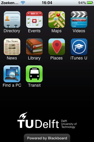
Apple has begun indiscriminately rejecting apps, ostensibly for having “rounded icons” – specifically citing from their guidelines, “Apps which appear confusingly similar to an existing Apple product or advertising theme will be rejected."
It appears that we and other developers are getting caught in the crossfire between Apple and Samsung, who are fighting over an array of intellectual property rights (notably the design aspects of their platforms). This is unfortunate as our default icons have been a paradigm that we’ve utilized in over 100 app submissions. In fact, when we were first developing iStanford, some of the folks at Apple helped advise us on this particular aspect.
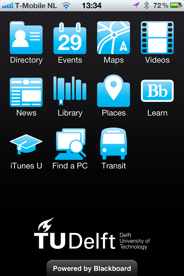
Given this predicament, please know that we are keeping on top of this and have already created alternate icons as an immediate solution and are concurrently in talks with Apple. The longer term solution may include revamping our entire platform design, but for the interim these new module icons are acceptable according to Apple's guidelines.
We hebben nu dus de ikonen aangepast en nu is de app weer beschikbaar. Voor consistentie, is de Androi-versie ook geüpdatet. Hieronder de oude en de nieuwe ikonen:
No feedback yet
Form is loading...

